Data Analysis with AI: Does Rain Actually Boost Chicken Delivery?
Everyday business, solved with data — Part 1
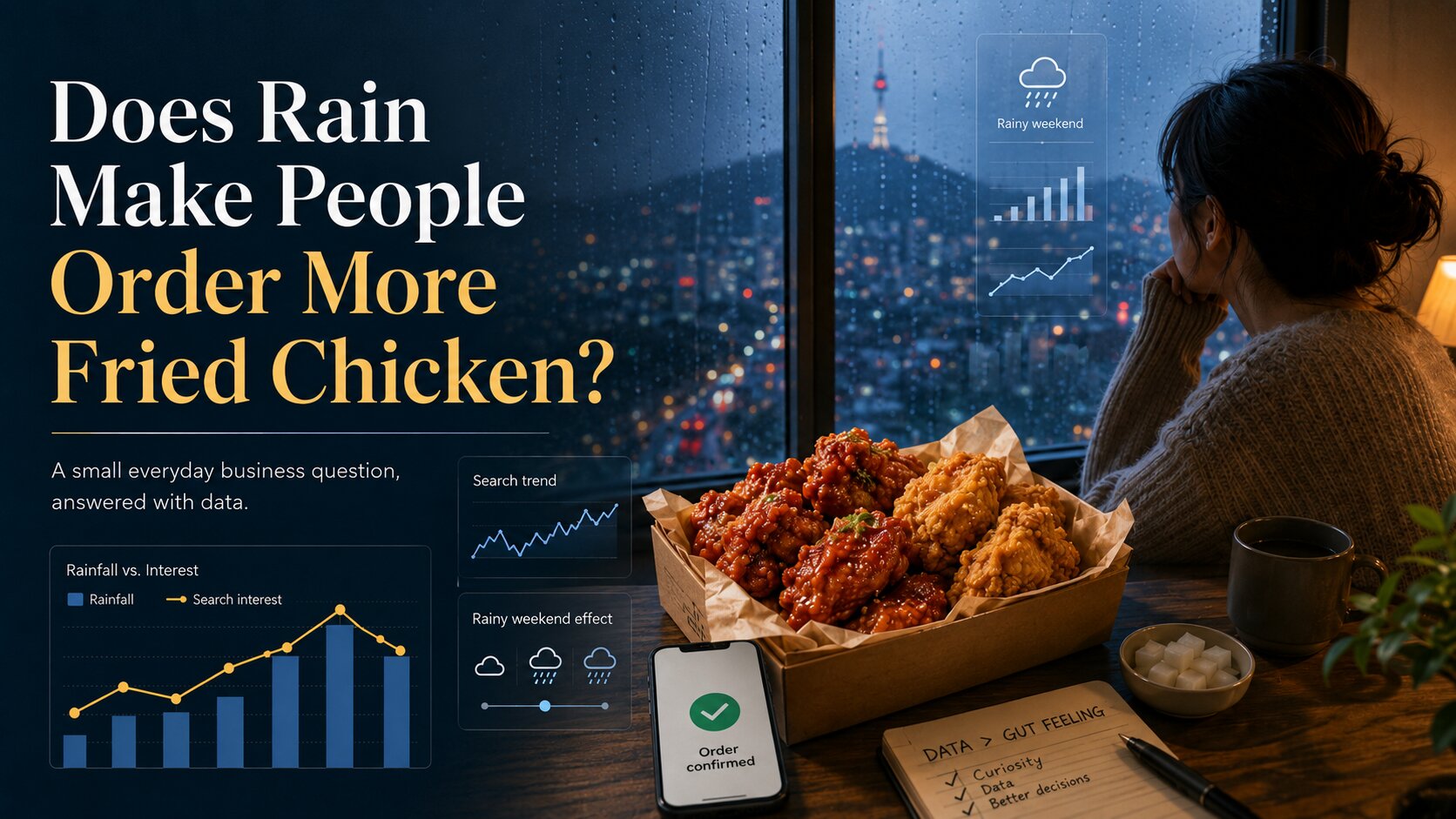
It rains out of nowhere today, and while I was eating chicken I’d had delivered, a thought hit me:
When it rains, does chicken delivery really go up? And what about when it gets cold — do orders climb too?
Since the only thing I’m really equipped to do is analyze data, I wanted to settle this the data way. So I asked the one conversation partner I have on hand: ChatGPT.
Could we actually find an answer in the data?
Naturally, my one friend, fixer, and (sort of) personal assistant came up with an approach — and then went a step further and suggested I turn it into a series, handing me homework in the process. I’d been wondering what side project to pick up after work anyway, so I landed on the idea: a series that solves everyday questions with data.
Going forward, this series will be about taking the small questions that come up in daily life and working out how to answer them through data analysis. For the first installment, the question is exactly this: “Does chicken delivery go up when it rains?”
Because this is the world seen through a data lens, I’m not going to weigh in on which chicken tastes best. Taste is personal and different for everyone, so it isn’t a problem data should be solving.
If you just want to know which chicken sells the most, search “chicken sales” on Google or Naver. This series doesn’t cover the kind of thing you can answer with a one-step search.
What I want to cover here isn’t information you can look up — it’s questions you can only answer through data analysis.
A question you can answer through data analysis is one that depends on a lot of variables. Mapping the relationships between those variables and drawing a reasonable conclusion from them is what this series is mostly about.
So let’s run the analysis on the question: does chicken delivery go up when it rains?
1. The goal
In this piece, I set up the hypothesis that chicken demand actually rises on rainy days, and I want to test whether that hypothesis holds up.
In case someone who runs a chicken shop ends up reading this, let me say up front: this is research on a hypothesis, so please don’t take it as gospel. The data also only covers the last 90 days, so it won’t apply to every situation — I want to be clear about that from the start.
The reason this question came to mind is that on rainy days, going outside feels like a chore. Whether it’s eating out or running to the grocery store, people don’t want to leave the house — so delivery naturally goes up.
And why chicken specifically? Because for me, “delivery” instantly brings chicken to mind. That’s a purely personal association, so there’s no special logic behind it.
So the theme of this piece is checking whether that personal association — chicken — actually shows up in rising chicken searches on rainy days.
The point of the analysis is to surface the relationships between different factors, and through those relationships, see how accurate our predictions really are.
2. The data
1) Weather data (weather_daily)
- Period: 2025-09-19 \~ 2025-11-18
- Columns: date, location, rainfall, temperature
- Region: Seoul
2) Google Trends (trend_daily)
- Period: 2025-09-19 \~ 2025-11-18
- Columns: keyword, region, trend index
- Region: Seoul
- Keyword: chicken
- Trend index: 0–100
I set up these variables to use weather data alongside the Google Trends index, so I could see how much the chicken search trend index actually rose on days it rained.
3. Storing the data
(If you don’t need the technical details, skip down to the analysis section.)
I pull the weather data and Google Trends data into Python via API, then store it in a database called Supabase. Supabase is a cloud relational-database platform built on Postgres.
What I need for this series is limited to database-level analysis. I could have used a cloud server and BigQuery on AWS, GCP, or Azure, but I wanted a lighter database environment, so I went with Supabase.
The basic structure: pull the data via API calls in Python in my local environment, then insert it into Supabase. That requires setting up the data tables in advance.
4. The environment
- Database: Supabase (PostgreSQL)
- Language: Python
- Pandas + Matplotlib + SQLAlchemy
5. The steps\, in short
- Collect the data
- Store it in Supabase
- Join with SQL
- Load into Python
- Visualize
- Run correlation analysis
- Draw a conclusion
Now let’s actually dig into the data.
Raw data
1) Daily weather data — rainfall
For daily weather data, I connect to a free open-source weather API called Open-Meteo (https://open-meteo.com/).
I need four fields — date, location, rainfall, and temperature (temperature comes into play in the next installment) — and I’ll join this against the Google Trends table. Five sample rows:
id | date       | location | rain_mm | avg_temp
-- | ---------- | -------- | ------- | --------
1  | 2025-09-19 | Seoul    | 8.4     | 18.9
2  | 2025-09-20 | Seoul    | 58.7    | 19.4
3  | 2025-09-21 | Seoul    | 0.0     | 20.8
4  | 2025-09-22 | Seoul    | 0.0     | 19.2
5  | 2025-09-23 | Seoul    | 0.0     | 20.8
A) Rainfall (rain_mm)
On rainy days, people tend to leave the house far less. The odds of skipping eating out and choosing delivery instead go up. And the heavier the rain, the greater the inconvenience → which can push order volume higher. It’s the most intuitive variable here, so I set it as the primary variable for capturing substitute demand for chicken orders.
B) Average temperature (avg_temp)
Temperature has a big effect on whether people want to go out. When it suddenly gets cold or hot, delivery demand tends to rise — and sharp temperature swings especially move human behavior. Temperature isn’t the core variable in this piece, but I use it as a supporting variable to compare against rainfall.
2) Daily Google Trends data — chicken demand
I pulled the Google Trends data through the Trends API. It expresses how often a given keyword was searched on a given date, on a normalized 0–100 trend index.
id | date       | keyword | region | trend_index
-- | ---------- | ------- | ------ | -----------
1  | 2025-09-19 | chicken | KR     | 33
2  | 2025-09-20 | chicken | KR     | 37
3  | 2025-09-21 | chicken | KR     | 34
4  | 2025-09-22 | chicken | KR     | 27
5  | 2025-09-23 | chicken | KR     | 26
A) Chicken search volume (trend_index)
When actual order data is hard to get, this is the most reasonable proxy available. It shows how often the keyword was searched on a given date. Since a search is the step that comes right before opening a delivery app or placing an order, it’s likely to reflect real demand fairly well — so I chose it as a suitable stand-in for actual delivery volume.
3) Joined data
This is the table created by joining the weather data with the Google Trends data — the draft of the raw data I’ll analyze. (Keyword is “chicken” throughout, so I’ve dropped that column here.)
date       | location | rain_mm | avg_temp | trend_score
---------- | -------- | ------- | -------- | -----------
2025-09-19 | Seoul    | 8.4     | 18.9     | 33
2025-09-20 | Seoul    | 58.7    | 19.4     | 37
2025-09-21 | Seoul    | 0.0     | 20.8     | 34
2025-09-22 | Seoul    | 0.0     | 19.2     | 27
2025-09-23 | Seoul    | 0.0     | 20.8     | 26
2025-09-24 | Seoul    | 28.7    | 20.8     | 25
2025-09-25 | Seoul    | 1.1     | 21.2     | 30
2025-09-26 | Seoul    | 0.0     | 20.1     | 32
2025-09-27 | Seoul    | 0.0     | 21.0     | 35
2025-09-28 | Seoul    | 19.6    | 19.4     | 32
Processed data
1) Rain-bucket data
This averages the trend index across rainfall buckets. I split rainfall into four buckets — 0mm, 0–10mm, 10–20mm, and 20mm+ — but there was no rainfall over 20mm in the last three months, so only the 0mm and 0–10mm buckets have values.
rain_bucket | avg_trend | days
----------- | --------- | ----
0mm         | 37.7      | 23
0~10mm      | 34.6      | 38
At 0mm the average index is about 37.7, but with light rain (0–10mm) it actually dips. You can read this as: light rain isn’t enough to meaningfully change delivery behavior.
2) Weekday + weather combination data
For weekdays, 0 is Monday and 6 is Sunday — so 0–4 are weekdays and 5–6 are the weekend. The arrows mark the weekend rainy-day spikes.
weekday | weather | avg_index
------- | ------- | ---------
0 (Mon) | rainy   | 38.8
0 (Mon) | sunny   | 35.7
1 (Tue) | rainy   | 30.0
1 (Tue) | sunny   | 29.1
2 (Wed) | rainy   | 32.5
2 (Wed) | sunny   | 31.1
3 (Thu) | rainy   | 26.5
3 (Thu) | sunny   | 32.2
4 (Fri) | rainy   | 28.3
4 (Fri) | sunny   | 43.8
5 (Sat) | rainy   | 46.8   <--
5 (Sat) | sunny   | 35.7
6 (Sun) | rainy   | 44.2   <--
6 (Sun) | sunny   | 39.2
Across weekdays (0–4) there doesn’t seem to be much of a relationship between sunny and rainy days. But over the weekend (5–6), the index jumps sharply on rainy days.
What this data tells us:
On weekdays, rain doesn’t raise chicken searches — but on the weekend, rain sends them up sharply.
So, the conclusion?
The hypothesis I started with was: does chicken ordering go up when it rains?
To check whether it held, I collected the data and analyzed it with SQL. By my analysis, the data shows that on weekdays, rain doesn’t increase chicken orders, but on weekends, rain does.
This is what data does — it not only confirms (or rejects) our hypothesis, it also points out the details we never thought to look for.
Going forward, I’ll add Python visualizations on top of the SQL analysis, and keep working through everyday questions with data.
Originally written in Korean on Brunch: https://brunch.co.kr/@chunja07/167
Get the next one in your inbox
One email per new post. No spam, unsubscribe anytime.
By subscribing you agree to our privacy & marketing email policy.